The effectiveness of your sign is dependent on the readability of the design.
Logos
Your logo or product should be prominent.
Size
Everything on your sign should be as big and bold as possible. First row of text should be about 18” tall to be read from hundreds of feet away. Most of our signs start to be seen from over 600’ away.
“ APCO Distance Legibility Chart“
Source: Wayfinding, People Signs & Architecture, Paul Arthur 1992
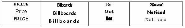
Fonts and Case
You should use thick, simple fonts with normal spacing.
Upper- and lower-case type is easier to read than all uppercase letters.
Too tight letter spacing decreases readability.
Too loose letter spacing breaks up the words.
At distances heavy letters become blobs and very thin letters become invisible.
Ornate script, highly distressed or highly stylized faces, and excessive contrast between thick and thin fonts decrease legibility.
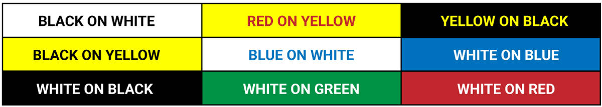
Colour and Contrast
There needs to be a high level of colour contrast between the background and the text or the image.
Examples: Contrasting colours (works):
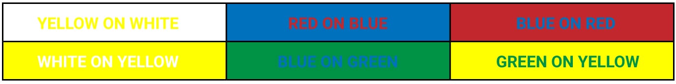
Non-contrasting colours (doesn’t work):
Message
Should be brief and eye catching. Limit the sign to one message and keep it simple.
Maximum of 8 words and 1 picture/graphic. 6 words for maximum effectiveness.
Images
Images need to be simple so they can be understood quickly.
Graphics that “bleed” off the edge will make the sign appear bigger.
Space usage
Make use of all available space.
The rules of “whitespace” for other forms of print media do not apply here.